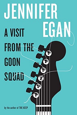
Designed by: Barbara deWilde
This is the original cover of Jennifer Egan's Pulitzer winning book. It is stark, simple, and manages to convey with the wild guitar strings that the book will be somehow all over the place.
It calls to mind product close-ups. Schematic drawings. The text resembles the designs for the Stieg Larsson books. Which were designed by Peter Mendelsund whom I discussed in my post on The Flame Alphabet.
Barbara deWilde is a great designer, famous even. She was the head designer for the Everyman's Library redesign in 1991. She did the covers for Memoirs of a Geisha and Game Change. In 2001 she redesigned Martha Stewart Living. She runs What The Book which is a fascinating look into how we feel about books.
She is a for serious designer.
Looking through the section of her website devoted to her designs you see work that is concerned with metaphor, austere imagery that conveys a bold message. You see deep design work. A love of beautiful book packaging. Including two of my favorite new editions of old favorites. The new Norton translation of The Canterbury Tales and one of the new Vintage editions of Nabokov.


 This is the cover for the paperback edition of Egan's book. It could be a totally different book. The colors are jarring, the collage effect is muddled and the text is in Helvetica.
Aside from the color palette there is that little black strip down the side. The cover is actually cut short so the black bar shows. The use of which is apparently so they can get not only the 'bestseller' nod but also a New York Times one. This version is by Jaime Keenan. Who happened to design a few of my favorite covers from a recent series of UK editions for Penguin. Keenan has done several great covers as well. Which is a shame because I hate this. A lot.
Another example is Robert Olmstead's Coal Black Horse. Here are the covers side by side:


The hardcover is on the left. This is a novel about a child caught in the horrors of the Civil War. A black horse saves his life. The original cover is somber, slightly unsettling, and very evocative. The prancing pony bathed in red on the paperback is oddly upbeat. It is still ominous, but the beauty of the original is lost.
Maybe they thought the single color on Egan's book lacked oomph. Maybe they wanted to portray the multiple narrators in a literal sense. I think the guitar strings popping in different directions but coming together to make the whole instrument enacts this idea in a more elegant way, but I am not a publishing house. The literal 'multiple people' image takes away the metaphor, the beauty, of the image. In the same way the beauty is lost in the Olmstead cover.
Another reason covers get changed is that they want to add one of those medals or a 'bestseller' masthead. Olmstead won the Chicago Tribune's Heartland Prize. You have to plop that thing on the cover somewhere. Maybe it would look too busy with the old large type and horse. Maybe it wouldn't stand out enough against that dark background that is similarly colored.
A final possible answer is that they didn't want to pay deWilde for the cover, or she has an exclusive contract with Knopf and the paperback was handed to Anchor. Though Anchor is owned by Knopf which is just confusing.


On the left we have the first US edition of Murakami's novel. The right is the paperback. I think the original cover is amazing. It's weird, confusing, endearing. All the things that Murakami's novel is. The paperback is beautiful in its own right and I think this is an example of the covers being equal in greatness. Publishers do test groups the same as movie studios. I'm guessing the publisher was told that the title was hard to read and the bird was scary on the hardback, hence the Audubon drawing and the larger typeface.
So do they ever make the cover better? And if not...why?
There are many examples of great covers on paperback. Most covers that are improved are from older novels getting an update. It is rare that a change in cover from hardback to paperback is an improvement. In fact I will give one more example of a bad one.

This is the cover of James Gleick's The Information. The cover is a tidal wave of words. Like the premise of the book, the information presented is a flood that will consume you if you do not know how to control and use it.

Ultimately the use of a paperback edition is to sell copies. Most people wait for the cheaper paperback before purchasing (I do) and publishers know this. So they tend to make the paperback editions brighter, with larger text, and tons of so-called praise tacked on.
There really isn't a point to my 'issue' beyond the general wish that we try harder. That publishers not view their customers cynically, that they let the artistic statements they approved the first time stand unless there is a genuine reason to change it. And, it would have the added bonus of costing them less.
Dust Jacket is a sometime article about the design and art of book covers. The idea is to shine a spotlight on the work of the designer separate from the author. Literally judging a book by its cover.
No comments:
Post a Comment